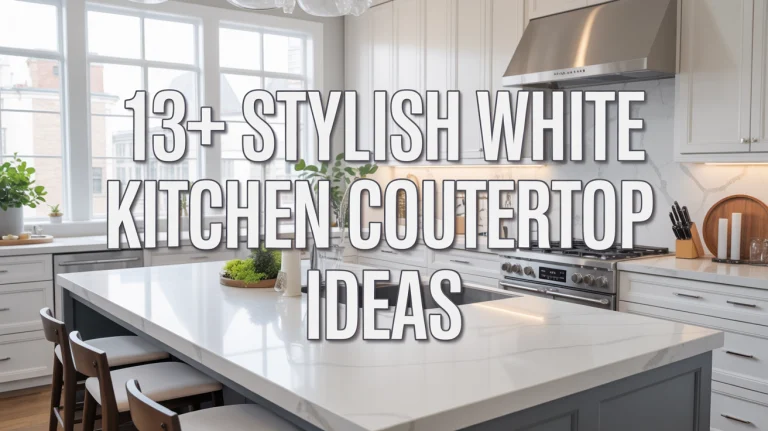
14+ Inspiring Kitchen Color Ideas to Transform Your Space
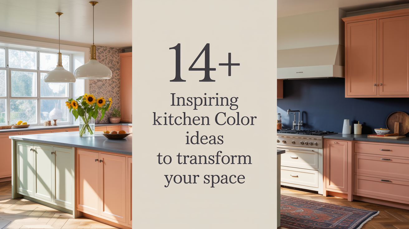
A kitchen’s color can change how the whole room feels. The right shade makes it calm, bright, warm, or lively. After more than twenty years helping people choose kitchens, I learned small choices matter. This article gives fourteen strong color ideas. Each idea shows how to use the color, how light and materials change it, and practical steps to get it right in real homes.
1. Soft Sage Green for a Calm, Lived-In Look

Sage green soothes the eye. It works on cabinets, islands, or walls. In kitchens with wood tones, sage makes the wood feel warmer. In white kitchens, sage adds a gentle note without taking over. Pick a paint with gray undertones so the color stays soft in all lights. Test a large sample on the kitchen wall and watch it through the day. Morning sun can make it look cool and fresh, while evening light brings out the warm gray beneath. For hardware, choose warm brass or aged nickel to keep a cozy feel.
2. Deep Navy for Grounded Sophistication

Navy blue gives weight and calm at once. It reads elegant on lower cabinets or an island. Navy pairs well with marble or pale counters to prevent the room from feeling dark. Use navy on the lower half of the kitchen and keep uppers light to hold brightness near the ceiling. Matte or satin finishes reduce glare and hide small marks. Lighting matters: add layered light above work areas so the navy does not swallow the workspace. Navy looks modern with brushed brass or copper hardware. A small navy accent can make other colors pop without dominating the room.
3. Buttery Yellow for Soft Cheer

Soft buttery yellow brings a gentle glow that feels sunny but not loud. It works well on walls or open shelves to warm up cool tiles and stainless steel. Choose a shade with slight cream undertones so it reads like light, not neon. Buttery yellow reflects light and can make small kitchens feel larger and friendlier. If you worry about overuse, use yellow on the island or a single wall and balance it with neutral cabinetry and a white ceiling. Keep finishes satin or eggshell so they clean easily and show soft light rather than shine.
4. Warm Earth Tones for Natural Comfort

Warm earth tones—think terracotta, ochre, or warm taupe—create a grounded, comfortable kitchen. These colors pair naturally with wood floors and stone countertops. Use them to tie together mixed materials in older homes or to add depth to modern kitchens. Layering is important: choose a primary warm tone and add lighter and darker shades in textiles, backsplashes, and small appliances. Earth tones hide wear well and feel forgiving in busy family kitchens. For balance, keep plumbing fixtures simple and matte so they do not compete with the warmth of the palette.
5. Muted Pastels for Soft, Modern Charm

Muted pastels like dusty rose, pale mint, or powder blue give a soft, modern charm without feeling childlike. Use them on lower cabinets, a breakfast nook wall, or on open shelving backs. These tones add personality without overpowering a neutral base. Pair muted pastels with clean white trim and natural wood to keep the look mature. Pastels can shift in different lights, so always test a paint patch near the sink and stove. Small splashes of pastel in accessories allow you to change the mood easily without a full repaint.
6. High-Contrast Black and White for Crisp Edges

Black and white is classic because it reads crisp and clean. Use white on upper walls and black on lower cabinets or the island. This contrast makes the work triangle clear and the room feel tailored. Black works best in durable, matte finishes that hide fingerprints. White keeps the space bright above eye level. Add a soft mid-tone on the floor or backsplash to avoid a stark feel. Metal choices of brass or matte black hardware reinforce the theme. Proper lighting keeps the black areas from feeling heavy while the white areas stay luminous.
7. Rich Jewel Tones for Bold Personality

Jewel tones such as emerald, amethyst, or teal give kitchens personality that feels grown up. These deep colors work best on a single strong element like an island, a bank of lower cabinets, or an inset pantry. Keep surrounding surfaces neutral so the jewel tone reads like a deliberate accent, not a flood. Jewel tones pair beautifully with deep wood and warm metal finishes. Use soft task lighting and under-cabinet lights to keep counters bright and to let the jewel tone be the feature without compromising function.
8. Soft Gray as a Flexible Neutral

Soft gray is a modern neutral that feels calm and versatile. It pairs well with wood grain, brass, and white marble. Gray works across styles from modern to farmhouse. Use a warm gray for cozy rooms and a cool gray where you want a more industrial edge. The key is undertone: pick the gray with undertones that match your floors and counters so it does not clash. Gray cabinets hide smudges and show age gracefully. Finish choice is practical; satin finish offers a forgiving surface that cleans easily.
9. Two-Tone Kitchens for Visual Balance

Two-tone kitchens split color between uppers and lowers or between cabinets and island. This approach lets you have a bold color and a calm color in the same room. Use a darker shade below where scuffs occur and a lighter shade above to expand the space. Keep trims and ceilings one neutral to connect the two sections. Two-tone setups are forgiving during updates because you can redo one section later without repainting the whole kitchen. This strategy gives style with less long-term risk.
10. Warm White with Texture for Quiet Elegance

Warm white walls and cabinets create a quiet, elegant backdrop that helps other elements shine. The trick is texture: mix matte paint with textured tiles, wood grain, or woven textiles to avoid a flat look. Warm whites feel softer than pure white and work in rooms with less natural light by reflecting a soft glow. Choose warm white on cabinetry and pair it with a slightly cooler white on trim for subtle contrast. Maintenance is easy; bright whites show dust but are simple to tidy and keep bright with regular cleaning.
11. Olive and Moss Greens for Subtle Depth

Olive and moss greens bring depth without drama. These colors lean earthy but still modern. They pair well with concrete counters and dark hardware for a contemporary farmhouse mix. Use these greens on lower cabinets or an island to anchor the space. They hold up well in high-use homes and age beautifully. Match textiles and pottery in similar tones for a harmonized look. Because green can shift warm or cool, test samples across the room to see how they rest against your countertops and appliances.
12. Soft Blues to Brighten and Calm

Soft blues feel fresh and calm. They work with white trim and warm wood to create a coastal or country mood. Use powder blue on walls or shiplap to add a sky-like calm. Blue reflects daylight in a way that brightens a room without becoming sharp. Pairing soft blue with brushed nickel or stainless helps the kitchen feel cohesive when you have modern appliances. If you want more energy, combine soft blue with a bolder color on the island for a playful contrast.
13. Warm Neutrals with Layered Lighting for Depth

Warm neutrals like biscuit, sand, and warm gray can read as timeless if paired with layered lighting. Use recessed lights for task areas, pendants over islands for character, and under-cabinet lights for work counters. The warmth of the paint helps light feel inviting at night. Layering lights lets you change the mood from bright cooking mode to soft evening glow without repainting. This combination also helps open-plan homes feel cozy while staying visually connected.
14. Moody Plums and Espresso for Intimate Spaces

Moody plums and espresso brown create an intimate, cocooning feel. These colors work well in large kitchens as accent walls or on a single run of cabinets. When used with generous natural light and reflective surfaces, deep plums read luxurious and intentional. Balance the depth with pale counters and brass or nickel hardware to keep the room from feeling heavy. Rich wood floors complement these tones and make the space feel finished.
Practical Steps to Pick and Test Paint

Start with small samples painted on multiple walls and on cabinet doors if possible. Live with the samples for a week to see how morning, noon, and evening light change the color. View samples from a few feet back to understand how the shade works at full scale. Consider the room’s fixed elements—countertops, floors, and appliances—before picking a final color. Choose low-VOC paints for indoor use and pick a finish that balances look and cleanability. Satin or eggshell finishes often work best in kitchens because they wipe clean but do not reflect too much light.