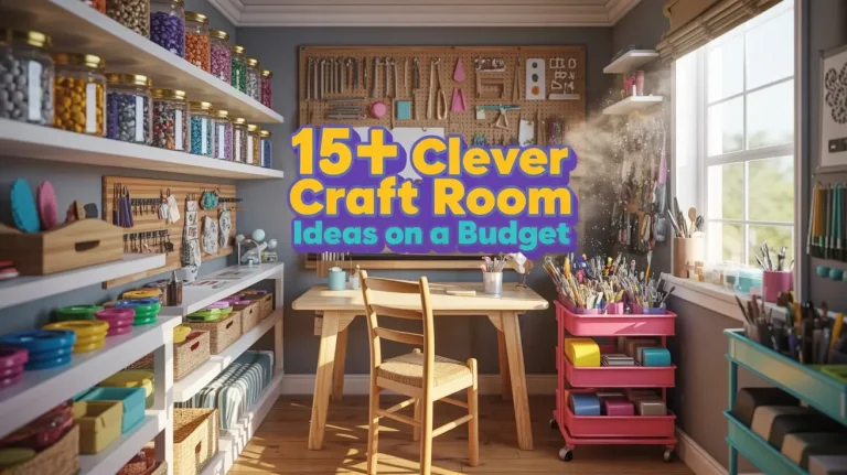
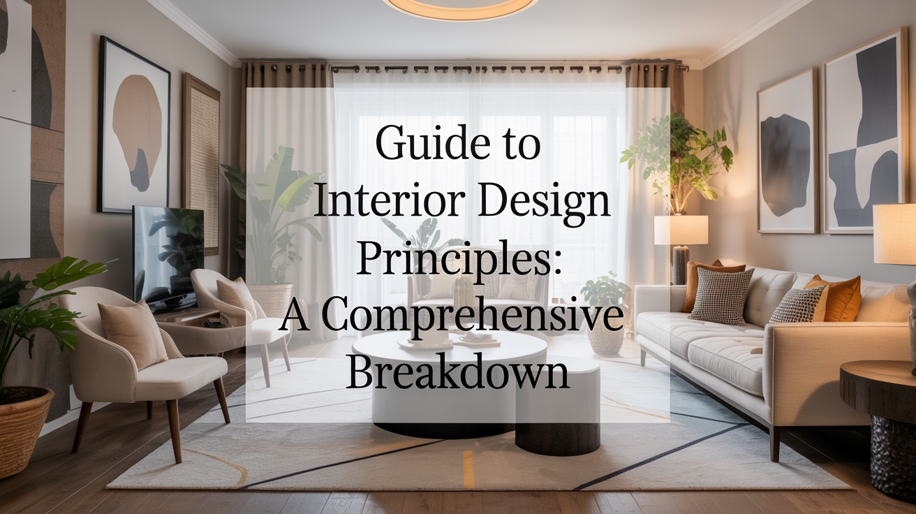
Guide to Interior Design Principles: A Comprehensive Breakdown
Introduction

Interior design is more than picking pretty colors or arranging furniture in a room. It is the art of shaping spaces so they feel natural, inviting, and functional. For more than two decades, I have worked with homes, offices, and hospitality spaces of every size, and the same truth always stands: design succeeds when it respects timeless principles.
This guide gives you a deep, easy-to-follow look at the foundations of design. You won’t find confusing jargon or vague advice here. Instead, you’ll learn how to apply the same ideas that professional designers use—broken down in a way that anyone can understand.
Let’s explore the key principles that transform an ordinary room into a space that feels complete.
1. Balance in Interior Design

Balance is the feeling of stability in a room. Every object has a weight, not just physically but visually. A tall lamp, a dark sofa, or a bright rug all carry different levels of attention. When balance is off, the room feels uneasy. When it’s right, the space feels calm and steady.
There are three main ways balance works. Symmetrical balance mirrors one side of the room with the other, like twin chairs across a fireplace. Asymmetrical balance achieves harmony with different objects that carry equal visual weight, such as pairing a tall plant with a group of smaller items. Radial balance spreads design elements around a central point, like a round dining table surrounded by chairs.
The key is noticing how your eyes move across the room. If your attention gets stuck on one heavy item without relief, the balance needs adjustment. Balance does not mean making everything match—it means creating equal pull across the space.
2. Rhythm That Guides the Eye

Rhythm in design is much like rhythm in music—it creates flow and movement. Without rhythm, a room feels scattered. With rhythm, the eye glides smoothly from one detail to the next.
Repetition is one way to build rhythm. Imagine using the same wood tone across shelves, frames, and side tables. Progression is another, where an element changes in steps, like a row of pendant lights that gradually vary in size. Contrast also creates rhythm by alternating between light and dark, soft and hard, large and small.
Think of rhythm as storytelling. A room should lead the eye on a journey instead of leaving it stranded. This is why designers repeat colors, shapes, or textures—so the mind recognizes a pattern and follows along.
3. Scale and Proportion in Design

Scale and proportion are the unsung heroes of good interiors. Scale is the size of an item compared to the room itself, while proportion is the size of one item compared to another. Together, they decide whether a space feels comfortable or awkward.
A massive sectional sofa in a small studio makes the room shrink. Tiny art pieces on a large wall feel lost. A chandelier hung too high loses its effect, while one hung too low overpowers the table. Getting scale and proportion right ensures that no item feels out of place.
Designers often rely on the “golden ratio” or simple fractions like two-thirds and three-quarters to guide proportion. While the math is subtle, the outcome is clear: furniture, lighting, and accessories must speak the same language in size. When the relationships are right, the room feels naturally ordered.
4. Harmony for a Unified Space

Harmony is what makes a room feel whole. It is the quiet agreement between color, texture, shape, and style. Without harmony, the space feels noisy and disjointed. With it, everything feels like it belongs.
Harmony doesn’t mean every element has to match. A rustic wooden table can sit beautifully in a modern dining room if other details—like warm metal accents or earthy fabrics—bridge the gap. The goal is to create a thread that ties everything together.
Think of harmony as the mood of the space. A soft, coastal palette of whites and blues gives a light, breezy harmony. A rich blend of dark leather, stone, and wood builds a grounded, cozy mood. The trick is consistency—choose a direction and let it guide each decision.
5. Contrast That Brings Energy

Contrast is what keeps a room from falling flat. It is the push and pull between opposites that adds energy and excitement. Light against dark, smooth against rough, bold against neutral—all of these create contrast.
Without contrast, spaces risk feeling bland. But too much contrast can cause tension. The art lies in balancing opposites so they spark interest without overwhelming the senses. A black-and-white color scheme is the most obvious form of contrast, but texture is equally powerful. Imagine a sleek glass vase against a rough brick wall—the difference brings life to both elements.
Contrast also draws attention to focal points. A bright painting on a muted wall, or a velvet chair in an industrial loft, instantly becomes the star of the room. Smart use of contrast helps guide the eye while keeping the design fresh.
6. Emphasis and Focal Points

Every room needs a center of attention. Without it, the eye doesn’t know where to rest. Emphasis provides that anchor. It could be a fireplace, a dramatic light fixture, or even a simple window with a great view.
The role of emphasis is to tell the visitor, “This is the heart of the room.” From there, the other pieces should support rather than compete. For example, if a dining room chandelier is the focal point, the table beneath it should complement its shape and scale, not fight against it.
Focal points don’t have to be dramatic. In smaller spaces, a carefully chosen piece of art or a well-styled bookshelf can serve the same purpose. The goal is clarity—giving the room a clear visual anchor.
7. Details That Refine the Whole

Details are often overlooked, but they separate good design from great design. The stitching on a sofa, the handles on a cabinet, the trim on a curtain—these subtle touches quietly elevate a space.
Details also create cohesion. Matching finishes on hardware, repeating motifs in textiles, or choosing a consistent edge style across furniture helps tie the design together. Small as they seem, details are what make the design feel intentional.
Designers often say the last 10 percent of effort brings the biggest transformation. Without details, even a well-planned room feels unfinished. With them, it feels complete and polished.
8. Functionality as the Core Principle

Beauty means little if a room doesn’t work for daily life. Functionality is the backbone of interior design. Every decision should consider how the space will be used.
A living room should invite conversation, not block it with awkward furniture placement. A kitchen should support workflow from cooking to cleaning, not force extra steps. Bedrooms should offer calm and rest, not clutter and distraction.
Good design anticipates movement, comfort, and purpose. It blends style with practicality so that a space feels not only beautiful but also livable. The most successful interiors are those where function and form walk hand in hand.
9. Light as the Invisible Designer

Light shapes how we see everything. It can enlarge or shrink spaces, warm or cool their mood, and highlight or soften their details. Yet light is often the most misunderstood element in design.
Natural light should always be maximized. Windows, skylights, and even reflective surfaces help bounce light deeper into the room. But artificial lighting is equally crucial. Layering ambient, task, and accent lighting allows flexibility—bright for work, soft for relaxation, dramatic for entertaining.
Lighting also enhances texture and color. A fabric that looks flat in shadow can glow under proper lighting. A wall that feels plain in daylight can come alive with focused uplighting at night. Treat lighting not as an afterthought, but as a design tool as powerful as furniture or paint.
10. Color as Emotional Language

Color is the most direct way to influence mood. Soft blues calm, warm reds energize, neutrals soothe, and bold tones excite. Choosing colors is more than a matter of taste—it is a language that shapes how people feel inside a space.
Consistency is key. A scattered palette confuses, while a thoughtful scheme comforts. Designers often use a base color for stability, a secondary for variety, and an accent for energy. But the ratios can shift depending on the desired mood.
Color also interacts with light, texture, and size. A dark wall in a well-lit room can feel dramatic, while the same wall in a dim room may feel heavy. Understanding these interactions allows you to use color with confidence and purpose.
Conclusion

Interior design is not a mystery reserved for professionals—it is a craft shaped by timeless principles. Balance, rhythm, proportion, harmony, contrast, emphasis, detail, function, light, and color all work together to create spaces that feel alive and whole.
By learning these principles and applying them with care, anyone can turn a room into a place that feels right. The goal is never just beauty—it is creating spaces where people can live, work, and connect in comfort.
This guide is your foundation. The more you look at spaces through these principles, the more natural design will feel. And once design feels natural, every space you touch will reflect not just style, but also purpose and life.