16+ Stylish Gray Paint Colors for Living Room Ideas
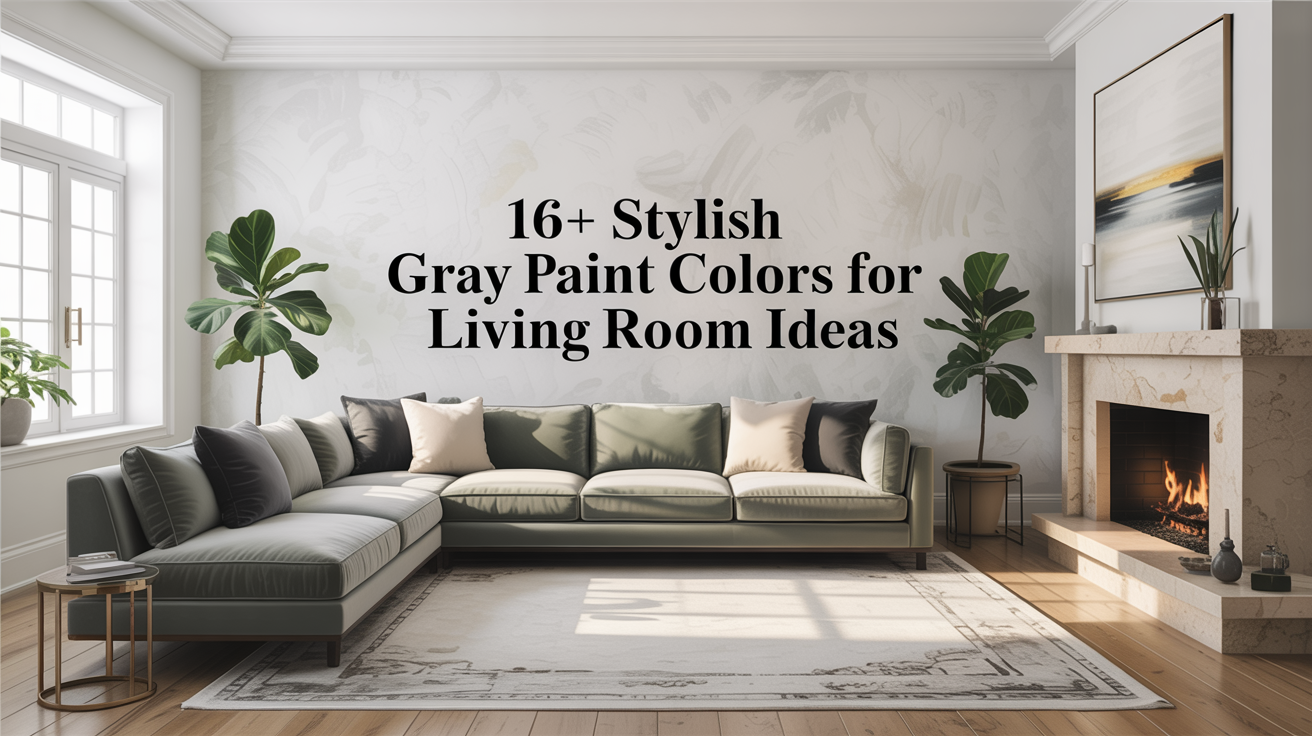
Gray is not cold when used right. After twenty years of painting rooms and helping people pick colors, I know one thing: gray can calm, lift, or make a room feel cozy. This guide shows sixteen gray choices that work in living rooms. Each section tells you what the color feels like, what light it needs, and how to pair it with furniture and trim. Read slowly. Picture your room. You can use these ideas even if you change furniture later.
1. Classic Cool Gray

Classic cool gray looks soft and clean. This gray has a little blue in it, so it reads crisp in bright light. Use it when you want a clean backdrop for bold art or sharp furniture. It keeps whites and black details looking fresh. If your living room gets a lot of sun, this gray will hold color well. In north light, add warm wood or brass to keep the room from feeling too chilly. Classic cool gray works with white trim and dark floors.
2. Warm Gray

Warm gray has a touch of brown or beige. It feels friendly and easy. Use it when you want a gray that hugs the room. It matches leather, wood, and woven textures. In rooms with low light, warm gray keeps things from feeling flat. Pair warm gray with cream trim and natural fibers to make the space feel lived-in. It is one of the safest grays for rental rooms because it hides small marks and suits many furniture styles.
3. Greige (Gray + Beige)

Greige mixes the calm of gray with the warmth of beige. It is a perfect balance when you cannot decide between cool and warm. Greige makes white trim pop softly without too much contrast. It looks great with plants and warm metals. Use greige in an open-plan room to keep the palette steady from one area to the next. If you need a neutral that works with both modern and classic pieces, greige is a strong choice.
4. Dove Gray

Dove gray reads light and airy. It is a soft gray that almost feels like a pale stone. Use dove gray on all four walls to create a calm cocoon. It reflects light well and keeps a room feeling open. Pair it with soft fabrics and light wood for a gentle look. Dove gray is good when you want a muted stage for colorful cushions or framed prints. It also lets natural light be the room’s main star.
5. Charcoal

Charcoal is deep and grounding. It can act like an anchor in a living room. Use charcoal on one wall as a focal point or on built-in shelves to make items pop. In a large room, charcoal on all walls can feel dramatic and warm if you add soft lighting and warm accents. Charcoal pairs well with cream, blush, and warm wood. Use satin or eggshell sheen to keep charcoal from looking flat.
6. Slate Gray

Slate gray has a hint of blue-green like river stones. It looks elegant and steady. Use slate gray in rooms with lots of windows or where you want a modern feel without feeling cold. It pairs beautifully with mid-century furniture, leather, and black metal. Slate gray also works well with patterned rugs because it is neutral but interesting. Add brass or copper accents for warmth.
7. Pewter

Pewter sits between silver and brown. It carries a subtle metallic feel without shine. Use pewter in rooms with mixed textures to make them blend. It gives a lived-in, slightly vintage look that is cozy and grown-up. Pewter looks great with deep-colored sofas and soft velvet cushions. It is forgiving on walls and masks small surface flaws better than very light paints.
8. Silver Mist

Silver mist is a pale, cool gray that catches light like soft mist. It keeps rooms feeling fresh and modern. Use it where you want bright walls that do not read white. Silver mist works well with cool wood tones and glass. In the evening, soft lamps bring out its quiet shimmer. This color is a good choice if you want a modern, calm room that still feels warm when the lights go low.
9. Steel Blue Gray

Steel blue gray leans toward blue but keeps a gray backbone. It reads peaceful and slightly moody. Use it when you want a living room that feels calm like a quiet sea. It pairs well with navy accents and white trim. Steel blue gray is also good with light oak or walnut furniture. In rooms that face east or south, the blue warmth will balance the sunlight and keep the room from feeling washed out.
10. Mushroom

Mushroom is a soft gray with brown undertones. It reads earthy and neutral. Use mushroom when you want the room to feel grounded and natural. It matches rattan, wicker, and green plants nicely. Mushroom works well in both small and large rooms because it keeps color subtle while adding depth. It is an easy friend to patterned upholstery and textured rugs.
11. Ash Gray

Ash gray is cool and muted, like ash from wood. It gives a lived-in, modern look that stays quiet. Use ash gray when you want your furniture to stand out. It pairs well with black frames and crisp white trim. Ash gray also helps modern lighting and simple lines feel more deliberate. If you want a Scandinavian or minimal look, ash gray is a great base.
12. Oyster Gray

Oyster gray is light with a whisper of cream. It feels soft like shell chalk. Use oyster gray to make a small room look larger without using stark white. It keeps the room warm and delicate. Oyster gray works with light-colored furniture and pale woods to make the feel of a room breezy and calm. It is forgiving in hallways and entryways that connect to the living room.
13. Fog

Fog is a misty gray that sits between cool and warm. It is quiet and steady. Use fog on walls where you want the room to feel calm and slightly mysterious. Fog pairs well with textured walls, linen cushions, and wide-plank floors. It plays nicely with matte finishes on furniture and soft, indirect lighting. This color makes a living room feel like a soft retreat.
14. Cobblestone

Cobblestone is a mid-tone gray with a bit of green or brown. It is an earthy gray that feels sturdy. Use cobblestone when you want a natural, grounded feel. It works well with stone hearths, wood beams, and classical furniture. Cobblestone is not showy but it makes everything around it look richer. Use warm lighting and layered rugs to keep the room cozy and inviting.
15. Graphite

Graphite is darker than charcoal and reads almost black in low light. It gives a modern, moody look when used with care. Use graphite on doors, trims, or in a statement nook to add depth. When used across an entire room, balance it with pale furnishings and plentiful light. Graphite makes metals and glass shine and gives contrast to light art or white molding.
16. Soft Silver

Soft silver is a pale, neutral gray with a slight sheen in bright light. It reads clean and refined. Use soft silver to create a calm, polished space. It pairs well with mirrored furniture and clear glass to feel airy and upscale. Soft silver keeps a room light while still giving the eye a rest from white. It is a good pick for open-plan living rooms where you want flow between areas.