The Ultimate Guide to Color Psychology in Interior Design
Color is more than just a visual element in your home. It shapes moods, affects behavior, and even influences decisions. With over 20 years of experience in interior design, I have learned that choosing the right colors can transform a space from ordinary to extraordinary. In this guide, we’ll explore how color psychology works in interior design, the science behind it, and practical ways to apply it to every room in your home.
1+ The Basics of Color Psychology in Interior Design

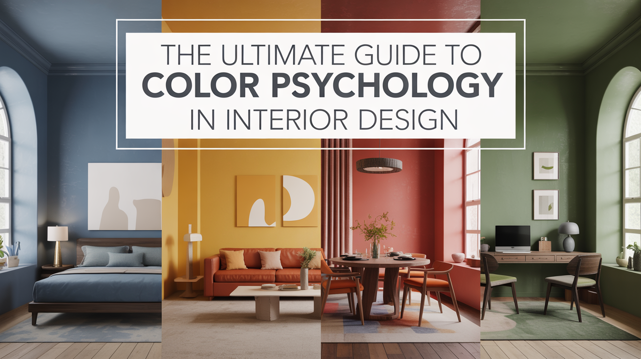
Color psychology is the study of how colors influence human emotions and behaviors. Each color evokes specific feelings. For example, warm colors like red, orange, and yellow can energize a room, while cool colors like blue, green, and purple create a sense of calm. Designers use these effects intentionally to create desired atmospheres in a space.
Red is often associated with passion, energy, and excitement, making it ideal for social spaces like living rooms or dining areas. Blue encourages relaxation and focus, which is why it works well in bedrooms and home offices. Green represents balance and harmony, making it perfect for areas where people seek peace and rejuvenation. Understanding the psychological impact of color allows homeowners to make choices that enhance their daily lives.
2+ How Warm Colors Affect Your Home

Warm colors like red, orange, and yellow can make a space feel cozy and welcoming. These colors are known to stimulate conversation and social interaction. A red accent wall in the dining room can make meals feel more vibrant, while yellow in a kitchen can create a cheerful, uplifting environment. Orange, with its playful and energetic tone, works well in spaces where creativity is encouraged, such as a home office or craft room.
Using warm colors requires balance. Too much red or orange can feel overwhelming or aggressive. Combining warm colors with neutral tones, such as beige or gray, can create a harmonious atmosphere while still benefiting from their energizing qualities. In practice, warm colors are not just about making a space bright; they are about enhancing energy, passion, and comfort when applied thoughtfully.
3+ The Calming Influence of Cool Colors

Cool colors, including blue, green, and soft purples, create calming and relaxing environments. Blue is known to lower blood pressure and heart rate, which explains why bedrooms and bathrooms often feature shades of blue. It promotes tranquility and mental clarity, making it ideal for spaces where people need to unwind or focus.
Green, as a color found abundantly in nature, creates a sense of balance and renewal. Incorporating green into living rooms or workspaces can foster relaxation while subtly boosting productivity. Soft purple tones can add a luxurious and introspective feel to a room, encouraging reflection and calm. When designing a space with cool colors, pairing them with lighter neutrals helps maintain an open, airy feel, preventing the space from feeling cold or detached.
4+ Neutral Colors and Their Versatility

Neutrals like white, beige, gray, and taupe serve as the backbone of interior design. They provide balance and allow other colors to shine without overwhelming the space. Neutral colors are not just “safe” choices; they create flexibility, allowing homeowners to change accent colors, furniture, and décor without repainting or major renovations.
White symbolizes purity and simplicity, often used to make small spaces feel larger and brighter. Gray conveys sophistication and calmness, ideal for modern, minimalist designs. Beige and taupe evoke warmth and comfort, blending seamlessly with both cool and warm tones. Neutrals also provide a visual resting point, which is essential for creating spaces that feel cohesive and intentional rather than chaotic.
5+ Using Bold Colors to Make a Statement

Bold colors like deep red, navy blue, emerald green, or mustard yellow are excellent for creating focal points. A single wall painted in a bold color can instantly draw attention and give a room personality. These colors are best used sparingly to avoid overwhelming a space.
Bold colors can also express individuality and style. For example, a navy blue living room with neutral furniture can exude sophistication and confidence. Deep red in an accent chair or artwork can add a touch of passion and energy to a room without dominating it. Understanding how to mix bold colors with neutrals or complementary shades ensures a balanced design while keeping the space visually interesting.
6+ The Psychological Impact of Color in Different Rooms

Different rooms serve different purposes, so the color scheme should align with the room’s function. Bedrooms benefit from calming colors like soft blues, greens, or lavenders to promote restful sleep. Kitchens and dining rooms thrive on warm tones that encourage conversation and appetite. Living rooms often combine neutral backdrops with bold accents to create versatile spaces for social gatherings.
Home offices or study areas should use colors that enhance focus and creativity. Light blue or muted green can help maintain concentration without causing stress. Hallways and entryways, being transitional spaces, often work best with neutral colors that provide a welcoming, uncluttered feel. By considering the psychological effects of color in each room, designers can ensure that every space supports its intended purpose.
7+ How Lighting Changes Color Perception

Lighting plays a critical role in color psychology. Natural sunlight can make colors appear more vibrant and warm, while artificial lighting can alter the hue and intensity of a paint color. Warm incandescent bulbs can enhance reds and yellows, making spaces feel cozier, whereas cool LED lighting can accentuate blues and greens, adding a crisp, clean look.
Designers often test paint samples at different times of day to see how lighting affects the color. A shade that looks calming in daylight may appear dull under artificial lighting. Combining lighting design with color selection ensures that rooms maintain the desired atmosphere regardless of time or season.
8+ Combining Colors for Maximum Effect

The key to successful interior design is not just choosing individual colors but understanding how they interact. Complementary colors, those opposite each other on the color wheel, create vibrant contrasts that energize a space. Analogous colors, which sit next to each other on the wheel, produce harmonious, serene environments.
For example, pairing a soft blue with a muted green creates a tranquil atmosphere, while combining red and teal can produce a striking, energetic effect. Layering colors through furniture, décor, and textiles allows designers to create depth and richness without overcrowding the space. The interplay of color can subtly influence emotions, guiding how a space feels and functions in everyday life.
9+ Cultural and Personal Influences on Color Choice

Color perception is not universal. Cultural associations, personal experiences, and even memories shape how individuals react to colors. In some cultures, red symbolizes luck and celebration, while in others it can represent warning or danger. Personal preference also plays a critical role; a color that feels calming to one person may feel uninspiring or dull to another.
Interior designers must consider these nuances when creating a space. Taking into account the homeowner’s personality, lifestyle, and cultural background ensures that the chosen colors resonate deeply and enhance the overall experience of living in the space. Customizing color schemes in this way elevates the design from functional to truly personal and meaningful.
10+ Practical Tips for Applying Color Psychology in Your Home

Applying color psychology in interior design requires thoughtful planning. Start by identifying the mood you want to create in each room. Test paint samples on walls before committing, and consider how lighting affects each color. Mix bold colors with neutrals to maintain balance, and use accents to introduce pops of energy without overwhelming the space.
Don’t forget the influence of textures and materials. Matte finishes can soften bold colors, while glossy surfaces enhance vibrancy. Incorporating natural elements, such as wooden furniture or plants, can complement color choices and strengthen emotional responses. By combining these strategies, homeowners can create spaces that are visually appealing, functional, and psychologically supportive.
11+ Common Mistakes to Avoid in Color Design

One of the biggest mistakes in color psychology is choosing colors solely based on trends rather than their emotional impact. A popular color may look beautiful but might not suit the function or mood of a room. Overuse of bold colors without balance can create tension, while neglecting lighting considerations can make even the best color choices appear wrong.
Another common error is ignoring personal and cultural associations with color. A room designed to impress guests may feel cold or uncomfortable to the residents if the chosen palette clashes with their emotional preferences. Successful interior design combines aesthetics with psychology, ensuring that the space feels right for everyone who uses it.
12+ The Future of Color in Interior Design

Color trends continue to evolve, but the principles of color psychology remain timeless. As sustainability and wellness become central to home design, colors that promote calm, balance, and connection to nature will remain in high demand. Designers increasingly use color to enhance mental health, productivity, and overall well-being.
Technology also plays a role in future color trends. Digital tools allow homeowners to visualize colors in their spaces before painting, while smart lighting can adjust hues throughout the day to match mood and activity. Understanding the psychological effects of color ensures that these innovations are used to enhance comfort and style rather than just novelty.