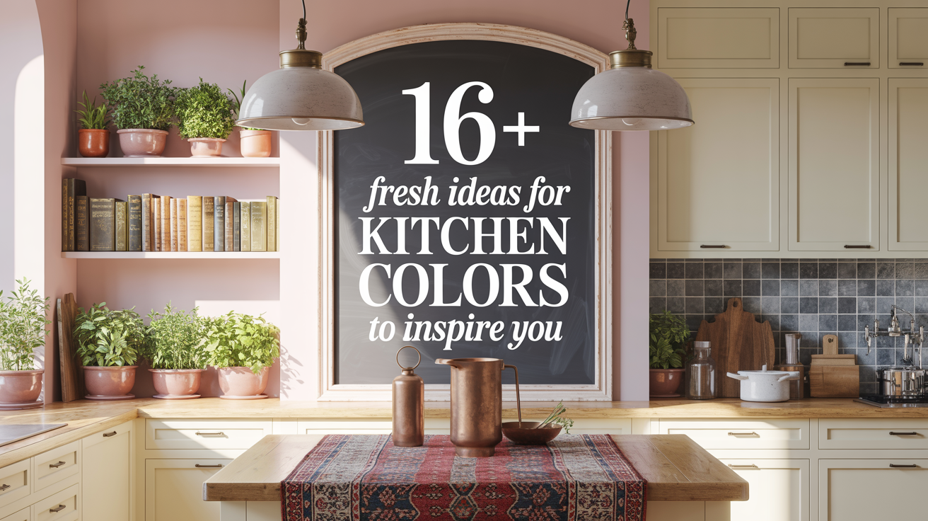
16+ Fresh Ideas for Kitchen Colors to Inspire You
A kitchen’s color is more than just paint on the walls—it’s the feeling you get every time you step inside. After over two decades designing kitchens for every kind of home, I’ve seen how the right color can make a small space feel big, a cold room feel warm, or a tired kitchen feel brand new. The best part? You don’t need a full remodel to make a dramatic change. Sometimes, just the right shade is all it takes.
In this guide, you’ll discover 16+ carefully selected kitchen color ideas that work with any style, budget, and home size. These aren’t generic “pick blue or green” suggestions. Each idea is backed by real-life design results, practical application tips, and timeless color theory.
1. Warm White for a Bright, Timeless Look
Warm white is the quiet hero of kitchen design. It reflects light beautifully, making the room look open and airy without feeling cold or clinical. The warmth comes from a hint of yellow or beige in the undertone, which softens the effect. In older homes with low natural light, it can erase shadows and bring a fresh, welcoming feel.
Pair warm white cabinets with wood accents to avoid a “washed-out” look. Oak flooring or walnut shelves can add depth and texture. The key is choosing a white that doesn’t lean too stark—something like creamy linen or soft ivory works for most spaces.
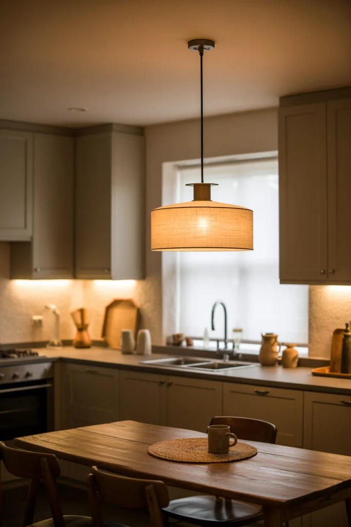
2. Soft Gray for Understated Elegance
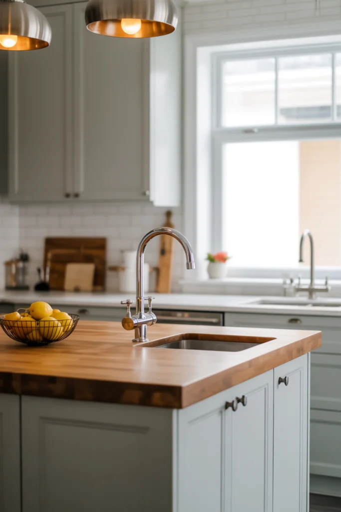
Soft gray is a designer favorite because it adapts to nearly any style. In modern kitchens, it reads as sleek and minimal. In traditional kitchens, it acts as a subtle backdrop that lets other details shine. The beauty of soft gray is its balance—it’s neither warm nor cold if you pick a neutral undertone.
If you have stainless steel appliances, soft gray will help them blend naturally. For warmth, mix in natural materials like butcher block counters or brass hardware. For a cooler, modern edge, pair it with black fixtures and polished stone surfaces.
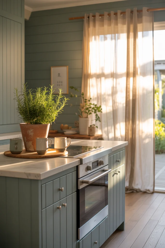
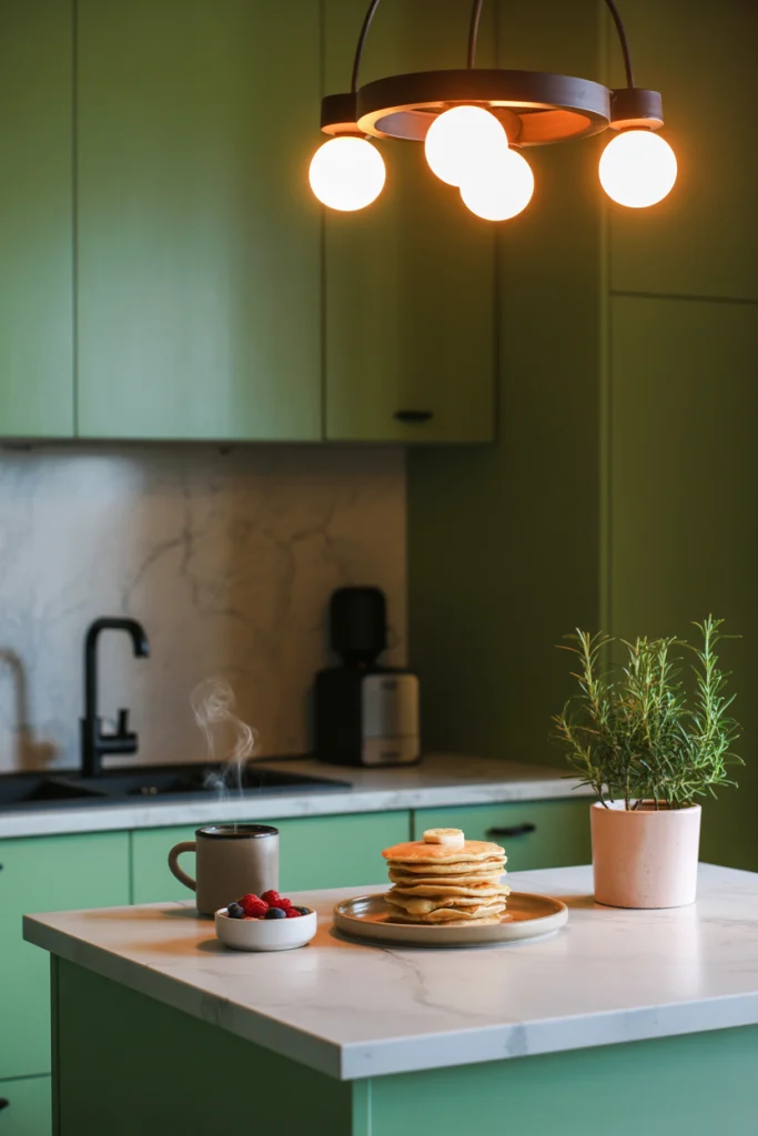
3. Sage Green for a Calming, Nature-Inspired Feel
Sage green is like bringing a breath of fresh air into your kitchen. It’s muted enough to feel timeless but has enough character to stand out. The natural undertones make it work beautifully with plants, wooden cutting boards, and woven baskets.
It’s an especially good choice for kitchens that open to gardens or patios. Sage creates a visual bridge between indoor and outdoor spaces, giving the whole home a cohesive flow. Matte finishes work best here—glossy green can feel overpowering.
4. Navy Blue for Depth and Sophistication
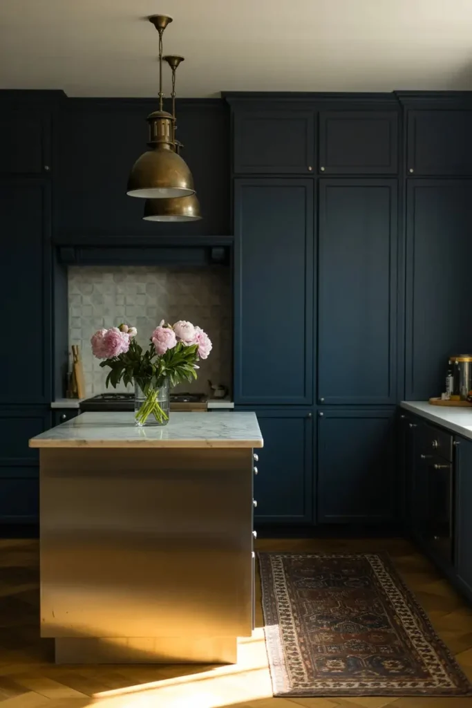
Navy blue adds drama without the heaviness of black. It’s deep, rich, and pairs well with crisp whites, warm metals, and even soft pink accents for a playful twist. Because it absorbs light, it’s best used in kitchens with good lighting—either natural or well-placed fixtures.
For a high-end look, try navy on lower cabinets with white uppers. This two-tone effect keeps the room from feeling too dark while still giving that bold, anchored base. Brass or gold hardware will make the navy pop even more.
5. Charcoal Gray for Modern Contrast
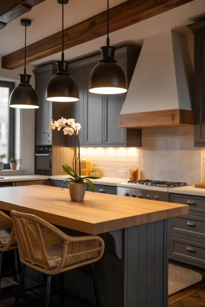
Charcoal gray is perfect for those who love a moody, modern vibe. It’s richer and bolder than soft gray, offering a striking contrast to white walls or pale stone counters. This shade works best in larger kitchens where it won’t overwhelm the space.
If you want to soften the look, add plenty of warm textures—think rattan stools, natural wood beams, or a butcher block island. Charcoal pairs especially well with matte finishes, which enhance its velvety appearance.
6. Terracotta for Rustic Warmth
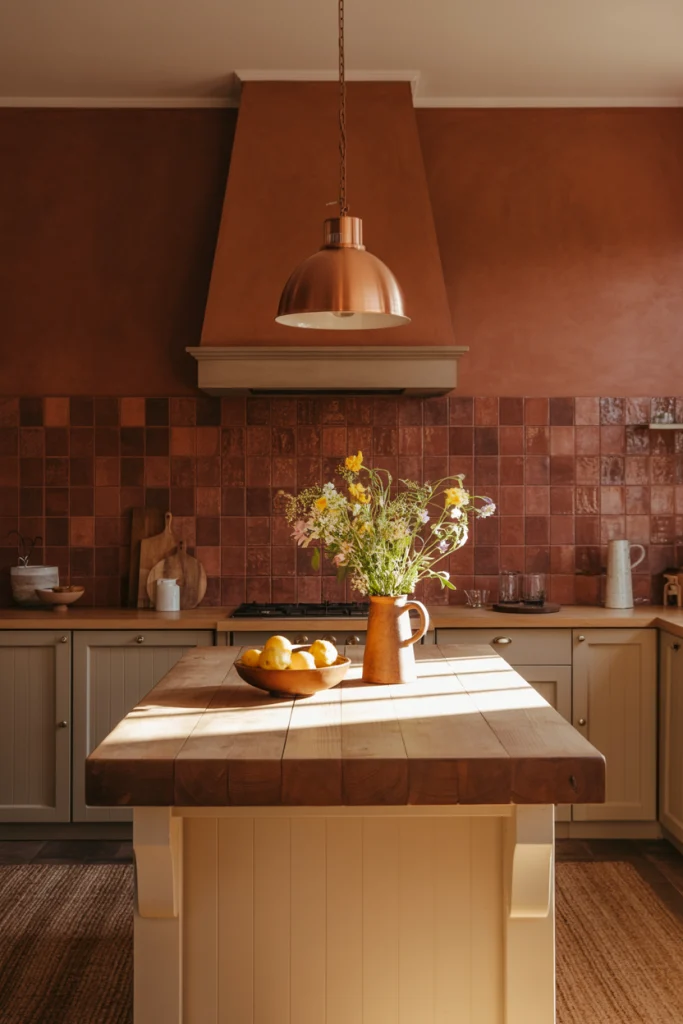
Terracotta isn’t just for floors—it’s a bold, earthy choice for walls, cabinets, or even tile backsplashes. The warm red-brown tone instantly adds a cozy, lived-in feel to a kitchen. It works beautifully in Mediterranean, farmhouse, or eclectic styles.
This color shines when paired with warm wood and textured ceramics. If you’re worried about it feeling too heavy, limit terracotta to an accent wall or backsplash, and keep the rest of the kitchen light and neutral.
7. Black for Bold, Luxe Drama
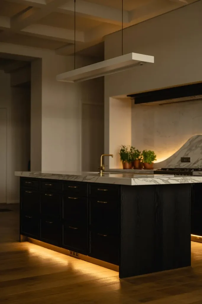
Black kitchens are the definition of modern sophistication. When used correctly, black can make every surface—marble counters, brass fixtures, wood floors—look sharper and more intentional. The secret is balance.
Use black on cabinetry or the island and keep walls lighter to avoid a cave-like feel. High-quality lighting is essential here—pendants, under-cabinet strips, and ceiling spots will keep the space welcoming instead of overwhelming.
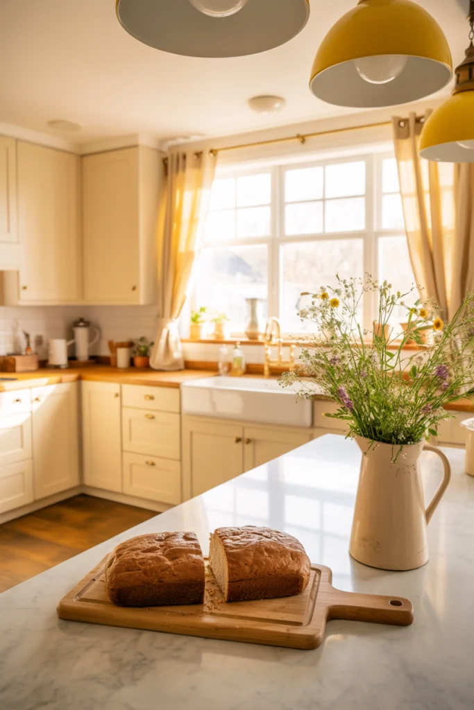
8. Cream for Cozy, Vintage Charm
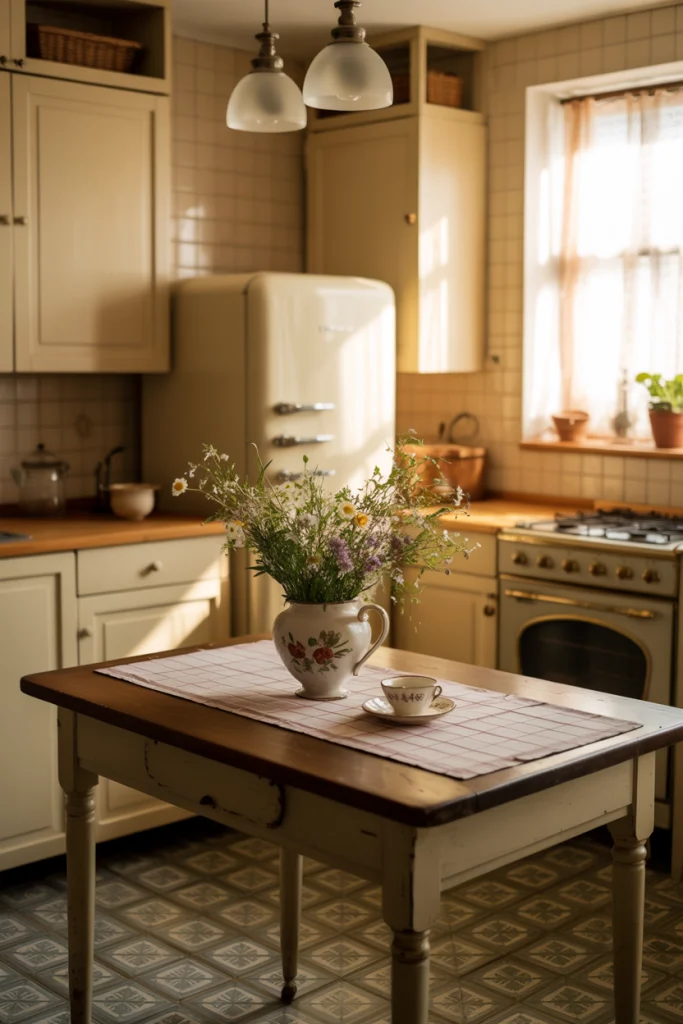
Cream is softer than white and warmer than beige, making it an ideal choice for vintage-inspired kitchens. It brings a gentle glow that works beautifully with antique furniture, retro appliances, and patterned tile.
In smaller kitchens, cream can make the space feel open but still inviting. To keep it from looking dated, mix in modern elements like sleek pulls or minimalist lighting.
9. Dusty Blue for Relaxed Coastal Style
Dusty blue has a faded, sun-washed quality that feels instantly calming. It’s often associated with coastal homes, but it can work in any setting where you want a relaxed, airy feel.
Pair it with white shiplap, pale oak floors, and soft linen textiles for a breezy vibe. In more modern kitchens, dusty blue pairs surprisingly well with concrete and matte black accents.
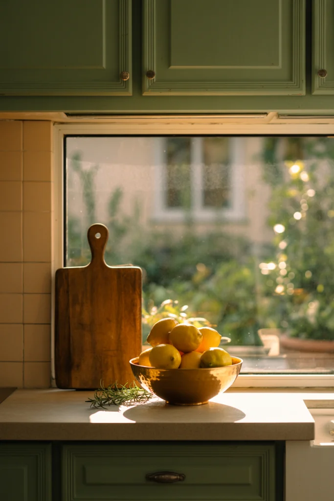
10. Olive Green for Earthy Sophistication
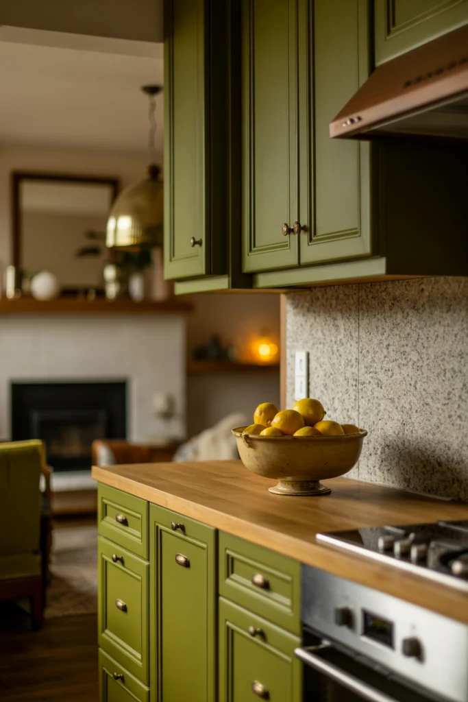
Olive green sits between muted and bold. It’s grounded enough for traditional styles but modern enough to fit today’s trends. It works especially well in kitchens with natural stone countertops or brass hardware.
For a refined look, pair olive with cream walls and natural wood shelves. For a bolder feel, combine it with patterned tile or rich walnut finishes.
11. Blush Pink for Soft, Unexpected Warmth
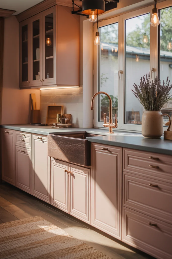
Blush pink in a kitchen might sound daring, but when used thoughtfully, it’s incredibly chic. The key is to stick to muted tones—think dusty rose or soft petal, not bubblegum.
Blush works beautifully with warm metals like copper or brass, and it pairs surprisingly well with gray or black for contrast. It’s a great choice for a playful breakfast nook or a modern, minimalist space.
12. Pale Yellow for Sunny Cheer
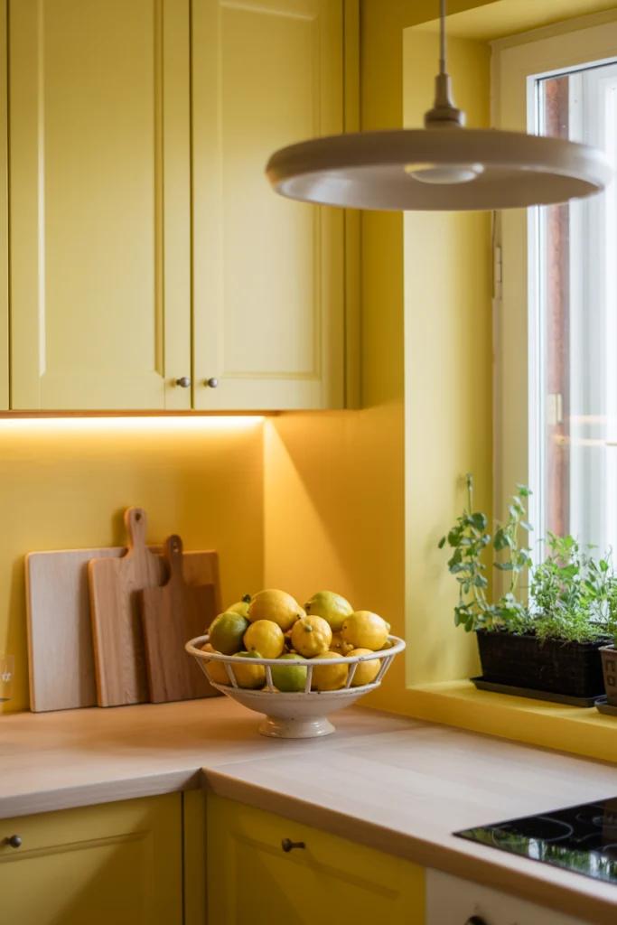
Pale yellow brings a gentle energy that brightens the room without overwhelming it. It’s perfect for kitchens that don’t get much sunlight, adding a natural warmth that feels welcoming at any time of day.
This shade pairs well with white trim, light wood, and touches of green. Keep the finish matte for a softer look or choose semi-gloss if you want a subtle sheen.
13. Greige for Modern Versatility
Greige—a mix of gray and beige—offers the best of both worlds. It’s neutral enough to go with anything, but the beige undertones keep it from feeling cold.
Greige works equally well in modern and rustic kitchens. With cool metals and stone, it reads contemporary. With warm wood and soft fabrics, it feels traditional and cozy.
14. Teal for Vibrant Energy
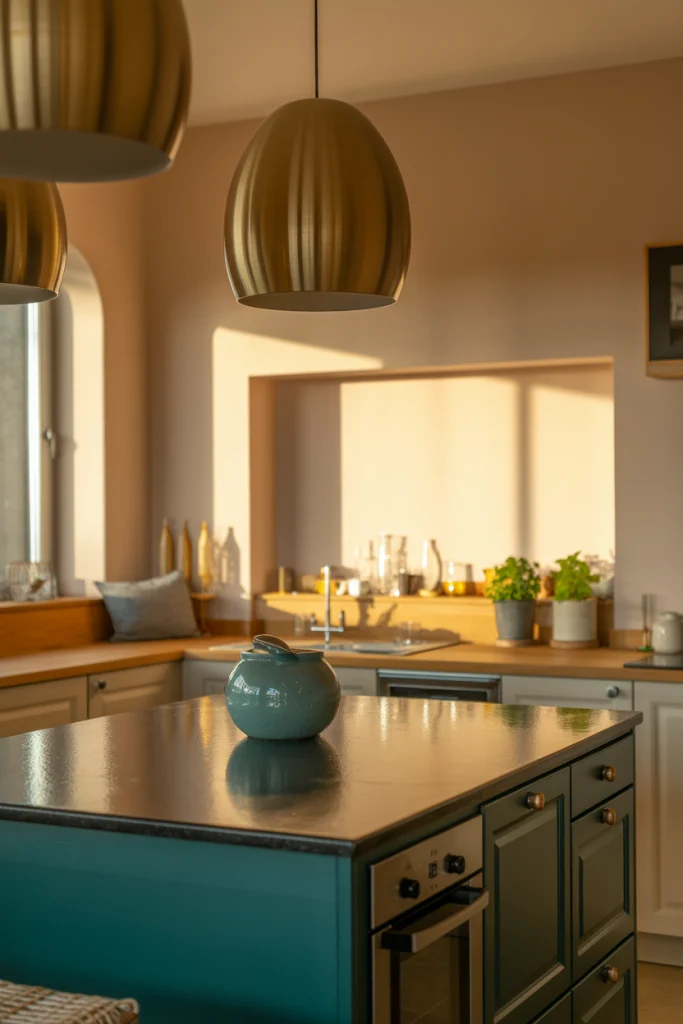
Teal combines the calm of blue with the energy of green, making it a vibrant yet balanced choice. It’s bold enough to stand out but not so bright that it overwhelms.
For balance, use teal as an island color or on lower cabinets. Pair with warm white walls and natural wood for a grounded, timeless look.
15. Light Taupe for Subtle Warmth
Light taupe is a softer, warmer alternative to gray. It brings just enough depth to make white counters pop without dominating the space.
It’s a wonderful choice for transitional kitchens that blend modern and traditional elements. Taupe pairs well with both cool and warm accents, making it incredibly versatile.
16. Coral for Playful, Modern Charm
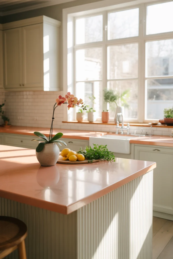
Coral is lively, cheerful, and unexpected in a kitchen. It works especially well in small doses—on an island, backsplash, or pantry door.
Because coral is so vibrant, pair it with neutrals and natural textures to keep the overall look balanced. White walls and light wood floors are perfect companions.
17. Mint Green for Fresh, Retro Appeal
Mint green feels fresh and a little nostalgic at the same time. It’s a nod to 1950s kitchens but works beautifully in modern designs when paired with clean lines and minimalist hardware.
To keep it from feeling too retro, mix it with white quartz counters and matte black fixtures. This gives mint a sophisticated, updated edge.